PAVILION CASE STUDY
OVERVIEW
Responsive website redesign for a local 501(c)(3) non-profit that is dedicated to helping individuals with mental illness and/or substance abuse.

Local non-profit, Pavilion, UX/UI responsive website redesign and implementation. This remote created project was research driven in simplifying navigation, increasing user engagement, and updating Pavilion's look while maintaining familiarity for their existing members.
User friendly writing, streamlined navigation, and accessible design guidelines were on the forefront of our redesign.
I was responsible for Research, UX/UI design, and implementation.
Role
Research
Competitive Analysis
UX/UI Designer
Created and Prototyped Style Guide
Duration
3 weeks
Tools
Figma
Trello
Miro
InVision
Team
Jessica Todryk - Project Manager
Jenna Belvedere
Lauren Mangold
Jessica Mosqueda
Kira Pannucci
PAVILION'S FORMER WEBSITE
Although Pavilion is a helpful local non-profit, their website had areas to improve.
The website's information architecture and accessibility required re-working, allowing the user to quickly access important information.
We wanted to include a sense of interaction and hope by incorporating interactive design elements.
THE DESIGN DANCE
User
Research
Interviews
Survey
Heuristic Evaluation
Persona
Affinity Diagram
Empathy Map
Storyboard
Competitor
Analysis
Omega Recovery
Substance Abuse and Mental Health Services Administration
Austin Clubhouse
Indirect: Coalition Recovery
Alcoholics Anonymous
Information Architecture
Card Sorting
Site Mapping
User Flow Diagram
Interaction
Design
Low Fidelity Prototype (InVision)
Mid Fidelity Prototype (Figma)
High Fidelity Prototype (Figma)
Website Hosting (Wix)
User
Testing
User Tests
A/B Testing
Task Flows
STEP 1: USER RESEARCH
We began our User Research trying to find an empathetic understanding of Pavilion's current users.
My focus was creating and iterating stakeholder questions, conducting stakeholder interviews, creating and iterating survey questions, and analyzing and interpreting qualitative data. I created the User Persona and the Storyboard.
FINDING PAVILION'S PURPOSE
Examples of questions I provided for the interviews and surveys conducted:
What does Pavilion excel at?
When you realized that you (or the person you know) were experiencing substance abuse and/or mental illness, how did you personally confront it?
What is your main purpose for visiting the Pavilion website?
Conducted group interview
1
Stakeholder
Interview
Created and iterated stakeholder questions;
9
Interviews
Created and iterated interview questions;
Conducted 1 member interview
108
Survey Responses
Created and iterated survey questions;
Created survey through Google Forms
The aim was to understand user' habits and preferences by utilizing a variety of methods of collection.
We found that 92% had been affected by mental illness or substance abuse.
Our users also experienced feelings of helplessness and isolation when beginning their road to recovery.
Our users also struggle to find a recovery journey that is right for them.
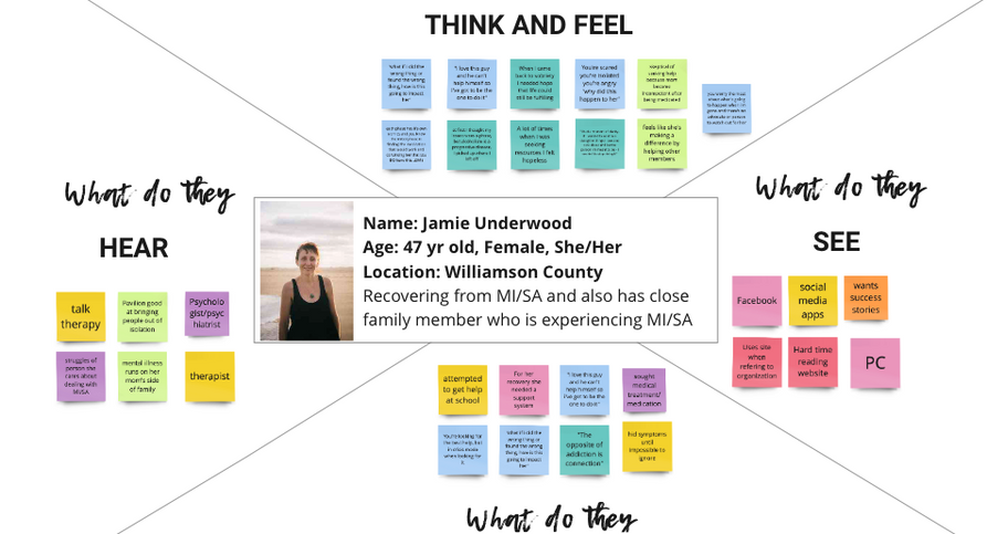
MEET JAMIE UNDERWOOD
We were able to visually create a user persona and affinity diagram after card sorting our research data from the surveys and interviews conducted.
Our research lead me to help synthesize Jamie Underwood, a potential Pavilion member living in Williamson County that requires assistance and resources for her substance abuse and mental health issues.
*Click on the image below for more details
PAVILION'S CURRENT WEAKNESSES


The group conducted heuristic evaluations covering aesthetics, content, navigation, and efficiency over several pages and found:
The non-profit's purpose was challenging to find
The page organization needs structure
The staggered secondary navigation under Resources lacked organization
EXPERIENCES
We had a clearer idea of who a typical Pavilion user was, their motivations for visiting the website, and some user pain points by synthesizing our user testing, heuristic evaluations, survey results, and interviews data.
We also found that some people coping with mental illness and/or substance abuse need help finding a path to recovery that is right for them. Pavilion is a nonprofit organization whose mission is to help their members find their way by providing life time support in various areas they might be struggling with.
We have observed that the current Pavilion website is underutilized due do its overwhelming navigation and the most important resources challenging to utilize.
5
User Tests
We each conducted a first time user test. I heard the following from my data:
"The mission of Pavilion is not very clear."
"I want a clear call to action for getting help."
"The navigation bar is overwhelming."
EMPATHETIC STATEMENT
How might we re-organize and redesign the Pavilion website to be more user-friendly and provide users with the most important and relevant resources?
STEP 2: COMPETITIVE ANALYSIS
I analyzed Pavilion's direct and indirect competition to learn from their well designed elements, as well as to avoid any poor design decisions they were making.
My study looked at 5 dimensions, evaluating the competitor site's homepage, structure, strengths, weaknesses, and opportunities.
I was responsible for creating the competitive analysis. I compared local and national, direct and indirect competitors.
Click on image to go to original Competitive Analysis
INSPIRATIONS
On the direct competitor's header, there was a phone number to call a person in the organization if the user was in crisis mode. I suggested we use that on our site, and we implemented it.
The calendar on the direct competitors site offered an option where users could suggest a class that they wanted to attend. I suggested this and also recommended offering to host a class as well. We implemented both these options.
I also suggested we include members success stories on the homepage so that potential users could begin to feel hopeful even before they get direct help from Pavilion. We also implemented on their current page.
STEP 3: INFORMATION ARCHITECTURE
The purpose of the redesign is to improve the information architecture of the Pavilion website, so we conducted card sorting studies to gain a better understanding of target users mental modes to guide the creation of a revamped information architecture.
REIMAGINING ARCHITECTURE
We created 59 cards to be sorted into categories. Each team member did their own and we collaborated to form one improved navigation for Pavilion.
We put our findings into an Affinity Diagram. Then we were able to create a Site Map to further develop the site:


STEP 4: INTERACTION DESIGN
LO-FI DESIGNS
For this step, we began by defining the important user flows based on our research, and with focus on the user's journey that are critical to the organization's and member's success. Our area of focus were:
Membership
Pavilion's primary focus is taking away the stigma of getting help.
Donations
As a non-profit, donations are fundamental for operation.
Resources
Members need resources to help regain their independence.
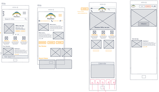
We started brainstorming some Low Fidelity designs using InVision.
After each group member drew their own design ideas, it was decided that the group preferred my mobile design the best.
Images with Pavilion's mission statement and who qualifies for services were placed in hierarchy order.
The scrollable success stories would be a fun interactive element for the users.
Footer navigation for easy one handed site navigation.
We implemented my low fidelity mobile design.


MID-FI DESIGNS
Using our Lo-Fi designs as a framework, we began to create our Mid-Fi for both desktop and mobile.


STEP 5: USER TESTING
OBSERVING
Our group tested 7 different homepage designs. Each change brought us closer to a more organized site reflecting our user's needs for membership information, easy to navigate resources, and playful design elements.


VISUAL LIMITATIONS
When we began turning our mid fidelities into high fidelities, one limitation we faced as a group was pleasing our stakeholder by not updating Pavilion's logo or main design colors.
We embraced the uplifting, joyful, and inspiring color palette. We wanted to incorporate these feelings into the users website experience by including a playful relationship of overlapping layers and button styles to convey interaction.
We wanted to fight our users feelings of isolation with their immediate site interactions.
I helped create the style tile. I created and prototyped the style guide.


HI-FI PROTOTYPES
Below is an embedded hi-fi Pavilion mobile prototype to interact with.

FUTURE OPPORTUNITIES
Stakeholder has requested voice recognition
Collect and build out bio pages for staff
Work with new social media volunteer to update content throughout pages
STEP 6: IMPLEMENTATION
Our group was responsible for building the site through Wix.
I built the Our Teams, Media, Students & Veterans Resources, and Food & Clothing Resources Pages.
The non-profit organization has chosen to hire someone to add their own style to our original designs.


